What Outfit Colors Should You Wear For Your Brand Photo Shoot?
Unsure of what colors to wear for your brand photo shoot?
Then you are going to love us for this! If you are just not sure about what colors look good on you & are stressing about what to wear for your brand photo shoot, you NEED THIS WEBSITE: https://colorwise.me/
All you have to do is upload an image of yourself (taken in natural light), and select your hair, eyes, and skin. It will generate the color palette that best compliments you!
Now, what happens if these colors don't match ANY of your brand colors?!
Yep, we understand. Our brand colors don’t match any of the colors suggested in our Colorwise.Me profile.
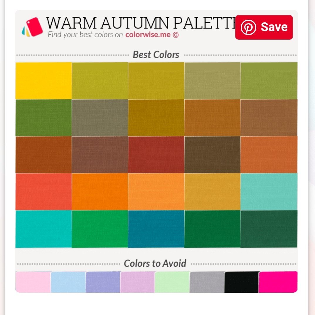
Below is our personal color palette. As you can see, there are a lot of fall colors, and at the bottom it specifically says that we should avoid pastel pink, blue, purple, green - which are OUR BRAND COLORS! YIKES!
At first we were really annoyed. But after taking some time to think about it while simultaneously questioning whether or not we should change our entire brand (we are dramatic, we know), we realized there IS a work around here.
And that is to incorporate your brand colors into your outfits AND the neutral colors in your color palette. We will use Michelle, our founder, as the example again. In the image below, she is wearing both pastel blue (a brand color), AND tan pants (one of the colors listed in my color palette). She has the best of both worlds here.
You don't necessarily have to mix your brand colors & palette colors in one outfit. For example, in some shots, you can wear all blue or pink. And in others, you can wear the neutral colors. We specifically say to focus on the neutral colors in your palette because you don't want the "actual" colors to clash with your brand colors, and therefore cause you to lose consistency within your brand marketing. For example, for our brand personally, we would not want to wear the deep red or green colors listed in my color palette in any of our photos, because those colors completely clash with our pastel brand colors. BUT we can get away with wearing the browns & grays because those are neutral and won't stick out as much (plus, since they are neutral, they can pair easily with our brand colors).
What do you think? Again, these are just guidelines to help make your life easier when it comes to preparing for your branding photo shoot & yield the best outcome! We want you to love the way you look and feel in your images. Outfits play a big role in that.


